Project Details
The goal: Research users’ pain points in meeting new buddies over meals and develop a solution.
Platform: Mobile App
Domain: Social Connection
Methods used: surveys, interviews, affinity diagram, persona, user’s journey, prototype (design systems & guidelines), and design critique
Tools used: Mural, Figma

Problem Space
The current state of bringing new people together over meals fails to address the need for personalized interaction in small groups for users who are looking for new buddies (instead of significant other).
Solution
A mobile app that helps users to:
Find, connect, and have meals with like-minded buddies who not only live nearby but also have similar interests, schedules, budgets, and food preferences.
Have control over the size of the group and determine who can join their event.
My Design Process
Overview

Research
After conducting secondary research to see what is already available in the market, I collected survey response and ran interviews.
Quantitative Data
Through the survey, I asked participants about their eating preferences.
Affinity Diagram
I clustered post-its into themes and identified patterns to analyze the results from the 4 interviews.

Key Research Insights
I summarized participants' pain points in meeting new people over meals as follows:
Persona
Based on the research, I developed a user persona, Emma Brown.

As-Is Scenario: Meet new people over meals
To better understand Emma’s experience, I created an As-is scenario and decided on which pain points (highlighted in yellow) that I would be focusing on.
Emma needs a way to…..

Ideation
After brainstorming ideas, I voted on them based on their visibility and impact, and then put them in the prioritization grid.
I decided to go ahead with the following 3 ideas
1. Find people with similar interests, food preferences, locations, and schedules
2. Create a group for meet up
3. Verify users’ credibility
Design critique & design iteration
Afterward, I went ahead with sketching, wireframing, and prototyping. I then asked two fellow Master of UX design at UofT for design critiques. Issues such as the use of colors and inefficient interactive elements were fixed and implemented in the final design.

Hi-fi Prototype & Storyboard
I chose a mobile app for Eatgether so users can use the services on the go.
Here are the three main task flows:
1. Sign Up and Complete Profile
New users will get a pop up window asking them to complete their profile
2. Find & Message Meal Buddy
Information on users’ profiles will be automatically applied during the search
Search results are sorted based on relevance. The top cards represent those that have the most similarities with the users.
3. Send an invitation, create an event, and approve new attendees
Users can set a maximum number of attendees for their event.
Users can choose whether new attendees need any approval from existing attendees or organizer.
Design
The typography, colours, and components that make up Eatgether.

Final Solution
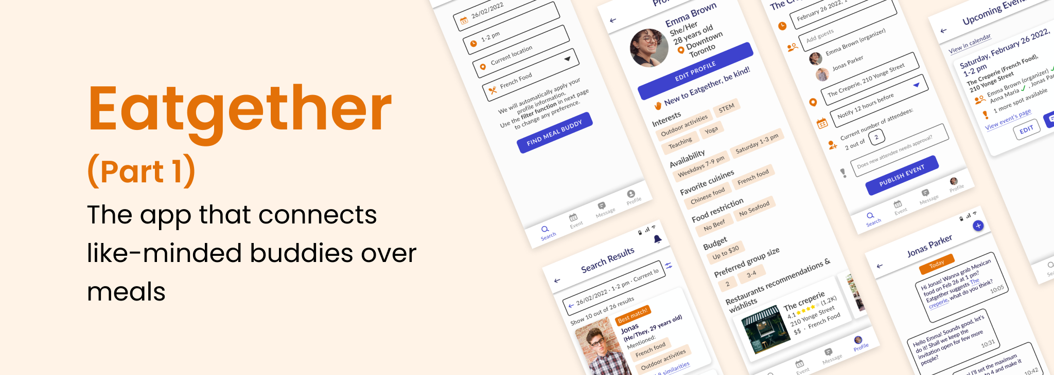
Here is Eatgether, a mobile app that connects like-minded buddies over meals.
Sign Up and Complete Profile
Find and Message Meal Buddy
Send Invitation, Create an Event, and Approve New Attendees
Reflection
Given that this project focuses on the User Interface design, here are some of the key things that I have learned throughout this project:
1. Following design guidelines
Throughout this project, I have learned to incorporate Material design guidelines to ensure that my design met the standard minimum text size, touch target, and other interactive elements for Android App.
2. Developing a design system
I have also gotten to practice my skills in creating and utilizing color and text styles as well as components and variants to speed up my design process. One of the biggest takeaway for me was to start developing design systems early on and modifying them as needed along the way.
3. Taking accessibility into account
Apart from thinking about how certain colors and typefaces convey different moods and feelings, I have also taken the accessibility factor into account, for instance, ensuring that there was enough contrast between the background and foreground elements. Additionally, I used different colors for interactive elements (in the case of Eatgether, it will be blue) and decorative purposes to avoid confusing users.


