Project Details
The challenge: Research and tackle international students' pain points in using their health insurance plans.
My Role:
UX Research: surveys, interviews, persona creation, journey mapping, usability testing
UX Design: ideation, sketching, wireframing, prototyping
Tools used: Mural, Figma
Teammates: Eleen Gong | Niharika Sharma | Samantha Balajadia | Shalette Dsouza
Summary
Problem Space
The burden of finding accurate healthcare information was placed on international students with little to no guidance.
Our Solution
A mobile app that helps students to:
Identify their healthcare coverage information.
Find nearby clinics and filter search results based on their specific needs.
Save the clinics for future reference.
Background
It began when a team of 6 international students were asked: “What matters to UofT students?”
The answer came from our personal experiences - understanding healthcare insurance plans and accessing healthcare services.
Why does the healthcare domain matter?
“Students should receive the support they need for their holistic well-being (physical, psychological, social and emotional).”
Design Process
Emphatize
Research
Our secondary research revealed that international students have two types of insurance plans that offer different services – UHIP (University Health Insurance Plan) and Supplementary Health & Dental Plans.
Details regarding healthcare insurance plans and services were scattered across multiple websites, making it hard to find relevant information when needed.
Afterward, we began our primary research in the form of online surveys and semi-structured interviews.
Research Result
We synthesized the data from surveys and interviews to form insights and uncover users’ major pain points:
91%
Students expressed being overloaded by the amount of information.
88%
Students found it difficult to find clinics that were covered under their insurance plans.
80%
Students felt they received misinformation around coverage.
75%
Students mentioned lack of information regarding the reimbursement process.
84%
Students were confused between UHIP and Supplementary plans.
It was clear that users were confused when navigating their healthcare information.
Define
Problem Statement
The burden of finding accurate healthcare insurance information was placed on international students with little to no guidance.
Persona
Based on our research, we developed our persona, Issa the international student.
User Journey
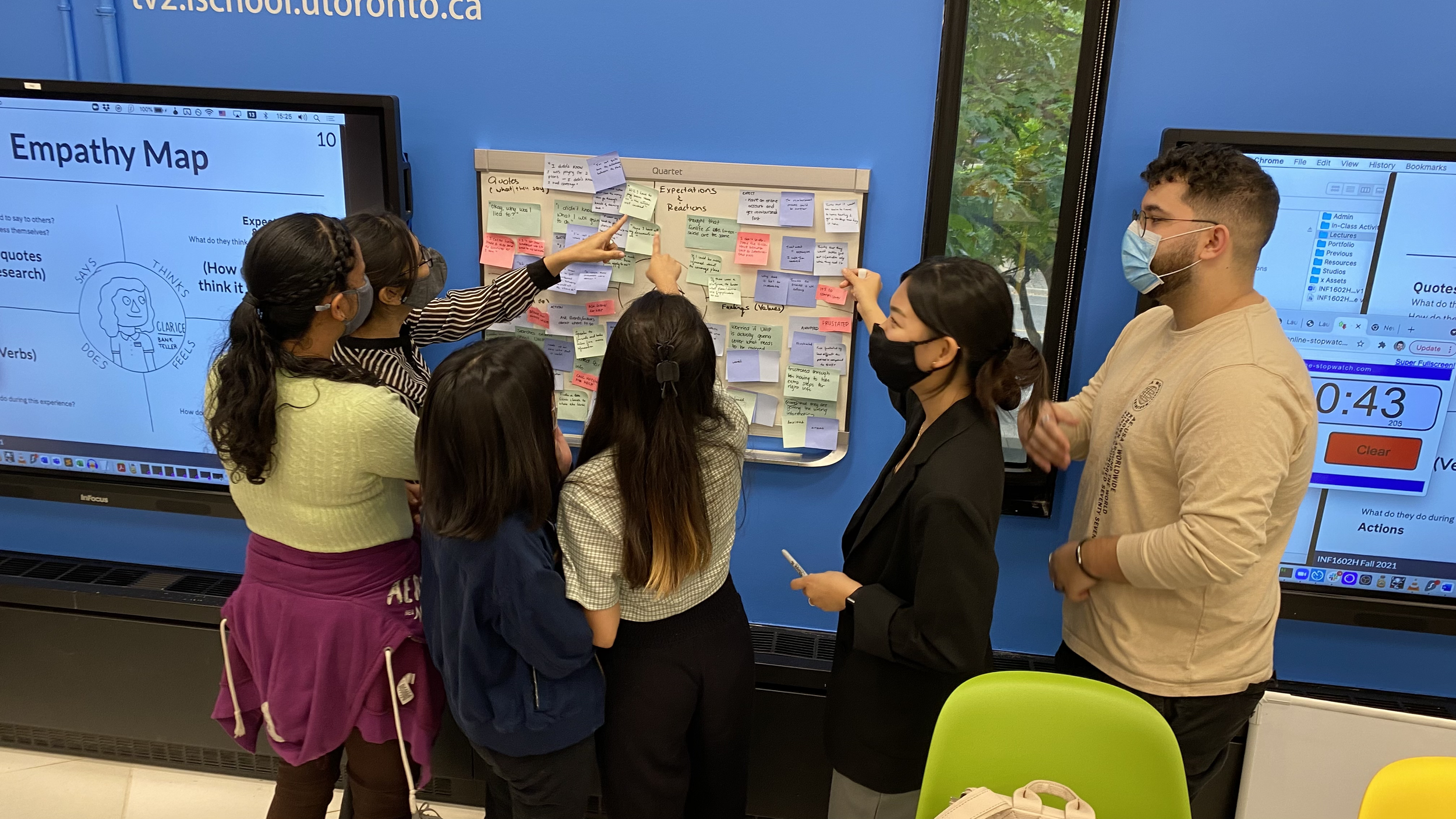
To put ourselves on Issa’s shose, we mapped out her journey and voted on the pain points that we would like to focus on.
Issa is overwhelmed by the amount of information. Even after browsing through resources, she still does not know what services are covered and which clinics she can go.
She gets to the clinic only to find out that she has to pay out of pocket and go through reimbursement process with no guarantee of getting her money back.
We then identified the three major issues that students faced in using their health insurance plans:
Design Goals
Design
Ideation
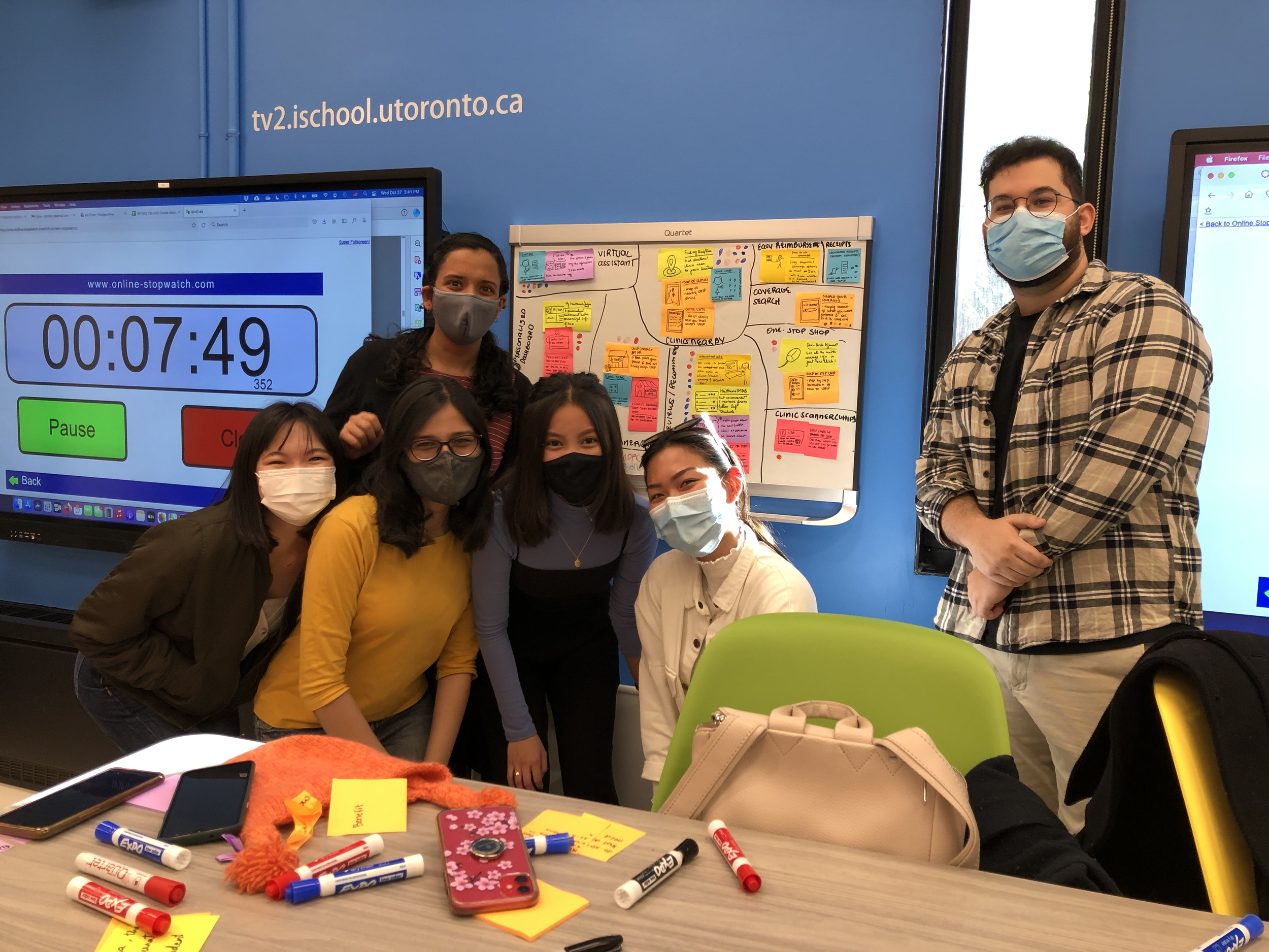
After brainstorming ideas individually, we voted on them based on their visibility and impact and then put them in the prioritization grid. We decided to go ahead with 2 homeruns and 1 quick win ideas:
1. Find clinics nearby
2. Personalized dashboard
3. Search your coverage
Design
Iterative Design
From there, we started ideating our lo-fi prototypes and went through multiple iterations. We decided to design a mobile app for UHealth+ so students like Issa can access their healthcare information on the go.
We focused on three main task flows:
1. Log in, Search and Filter Clinics
Students can log in using their UofT's unique login credential.
Search and filter clinics based on distance, insurance type, and whether any reimbursement is required.
Log in, find a clinic, and filter screens
2. View and Bookmark a Clinic
Students can see what services are offered by the clinics and whether they are covered by their student insurance plans.
Students can create list of bookmarked clinics so they only have to go through this process once.
Clinic and bookmark screens
3. View Insurance Cards and Coverage Information
Students can access their insurance cards.
Students can search what services are covered under their insurances then they can see a list of recommended clinics.
Screens for Insurance cards, services covered, and recommendations of clinics
Test
Lean Evaluation
Using the lo-fi prototype, we conducted lean evaluation with 3 participants to detect potential issues early on. Couple notable changes as follows:
Usability Testing
We further iterated our desing by conducting usability testing with 5 more participants using our mid-fi prototype. Here are some of the changes that I made in the hi-fi prototype:
Final Solution
Here is UHealth+, a mobile app that help students navigate and access healthcare information at ease.
Search and Filter Clinics
View and Save Clinics
View Insurance Card and Coverage Information
Next Steps
Given the limited time, we had to leave some ideas behind. Here’s how we would continue the project if we had more time.
Reflection
3 key things that I have learned throughout this project:


